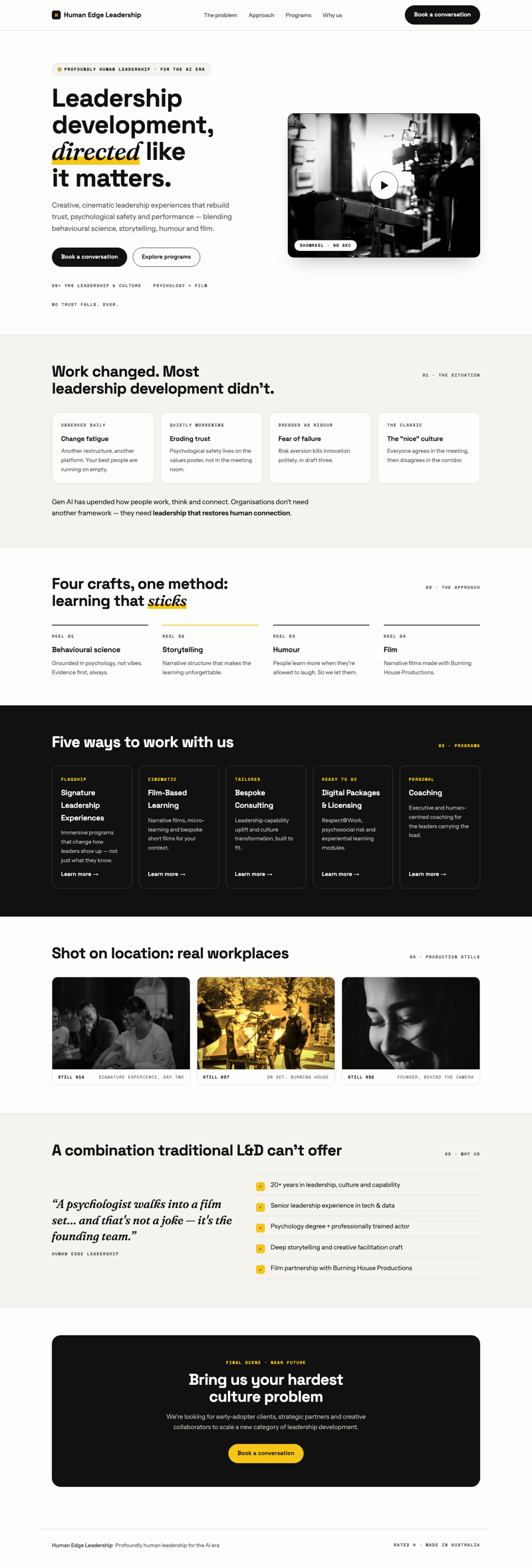
 Direction 01 · modern + retro wink
The Studio
Contemporary and polished — the most corporate-friendly read — with the retro personality kept in small doses: showreel card, reel numbers, one italic word.
View direction →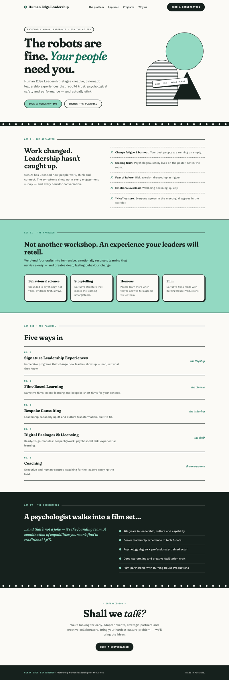 Direction 02 · retro mint
Intermission
Mid-century print — wonky serif, cut-paper shapes, film-sprocket dividers, act-by-act structure. Elegant and quirky, quieter than Matinee.
View direction →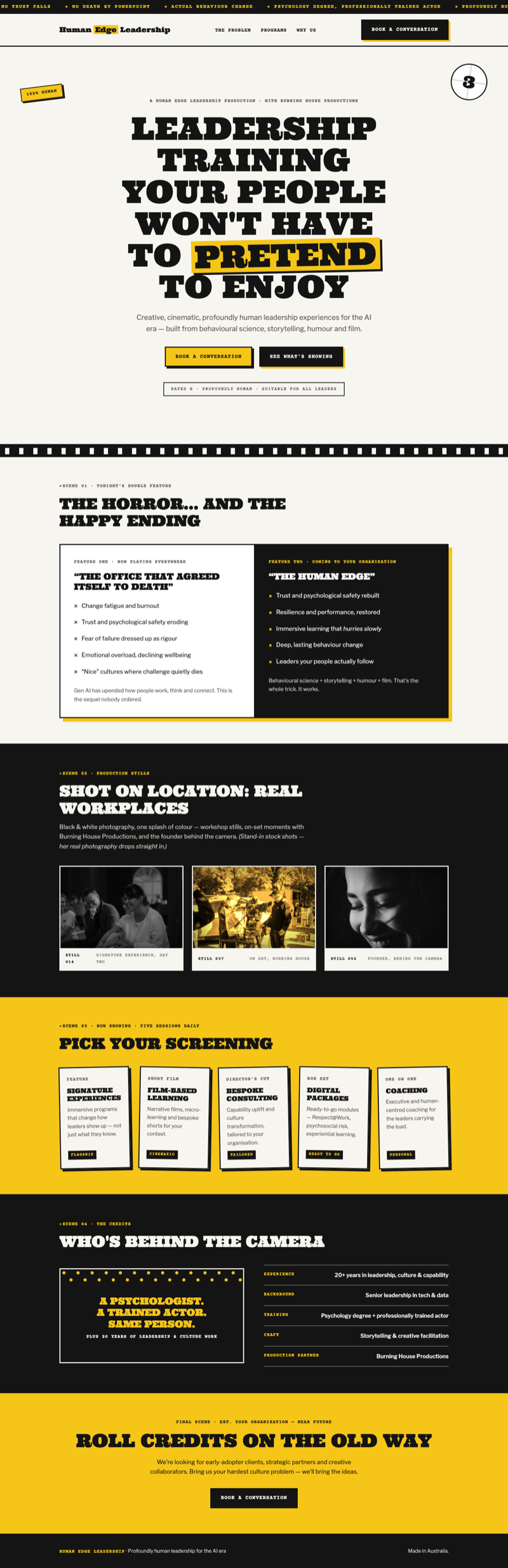 Direction 03 · retro lemon
Matinee
Full vintage-cinema poster. Loud type, screenplay slug-lines, a marquee ticker, tilted movie posters. The cheekiest of the three — unmistakably you.
View direction →